Monday, May 30, 2011

Palmarin's "Concentrata" パルマリンの 「同心円体」」

Overall view of exhibition at Blackfish with Palmarin's on the right side
二人展ーパアルマリンの作品は右


Palmarin Merges is a relatively young American artist of Philippine descent. Few months ago, she exhibited interesting mixed media pieces at Blackfish gallery. With black cloth background which makes shapes in it to come out, Palmarin's showed circular forms made of cloth, various printed papers and maps. She appropriate enough, called this exhibition"Concentrata".

パルマリン・ムージスさんは小柄な若いフィリピン系アメリカ人の芸術家。今年、春ブラックフィシューぎゃらりーで面白い、個展を開いた。黒い布のバックグランドに様々な円形のフォームをプリント紙、地図や布なので構成した作品を展示し、これらを"Concentrata" 「同心エンタ円体」と名のった。


View of various Concetrata pieces on the gallery wall.
様々な陳列されたコンセンツラター(同心円体)


Palmarin says variety of ideas and themes from previous works came together in this group of works. Among it is ideas associated with home. To her a circle is a shape that doesn't go very far; it stays close to home. The process she uses in these work, sewing is to her a process that is used to create clothing and other things needed for home and is associated with domesticity. Circle also to her is like rings of a tree, a symbol for time and growth. The piece "Concentrata 8444, (First Division)" with cell like concentrata going through either mitosis or meiosis with cellular growth seem to me emphasizes this growth idea further more.

パルマリンによるといくつかの前の作品のアイデアやテーマが今回の作品に含められているらしい。彼女は円は遠くに行かず、家のように身近にいると述べている。どうやらパルマリンは円を家のシンボルとみているようで彼女がよく使うアートのプロセスのソーイングは洋服などを作る、家庭作業である。もう一つ、パルマリンにとって円は木の輪のようなもので時と生長を意味しているようだ。それと作品[Concentrata 8444-First Division(最初の分裂」のように円形は細胞も意味するし、細胞の分裂は生長の面をさらにつよめている。


Concerta 8444 "First Division"
「コンセンツラタ8444-最初の分裂」


The installation piece below that contains 56 pieces of papers to make up the whole contain all these ideas of hers. 

下のインストレション作品は56枚の紙のコラージ作品で造られている。私もこの作品の展示を手伝ったがまとめるのに大変だった。

"Contour Lines, Targets and Growth Rings" detail, mixed media installation, 2011, 6'x8'
「外形線,標的と生長輪」 インストレション


Palmarin also likes to travel, and in her last exhibition, she made references to her move from California to Oregon by using maps among other visual elements to show the change. In this exhibition, her love for travelling has been shown in works like "Concentrata 8452 (Fl orida)" where map of Florida was the center of concentrata.

パルマリンは旅が大好きで彼女の前回の展示では、オレゴン州にキャルフォニア州から移住した時のイメージを地図などを作品に使いこの変化をあらわした。 この旅行好きを今回は「コンセンツラタ 8452」などの作品でフロリダ州の地図などを使い述べた。


"Concentrata 8452 (Florida)"
「コンセンツラタ 8452-フロリダ」


"Concentrata 8452 (Tokyo, Portland, San Francisco)"
「コンセンツラタ 8452-東京、ポートランド、サンフランシスコ」

In her much acclaim piece of year ago that was similar to these concentrata pieces but had island of Krakatoa as part of the title, "Krakatoa Before the Eruption". Some of the pieces in this show do look quite like islands. Palmarin's life seem to have a lot to do with islands. As noted earlier, her ancestors are from Philippine, a land of myriad islands, and she was born in Hawaii. She has lived and worked in Japan, and among the places she has traveled include Bali, Ireland, England, and Micronesia. All this shows in the piece below , "Concentrata 8440 (Islands).

昨年の彼女の作品「爆発すうぜんのクラカトア島」は今回の作品にかなり似ていておそらく今回の作品の形はこの作品からきたもののように私には見える。本人もそのようなことを述べていた。下のイメージの「コンセンツラー8442 列島」らこれらいくつかのの作品にも島のような形がけっこうみられた。パルマリンの一生には島の存在は大きい。彼女はハワイ出身でフィリピン系アメリカ人。バリ,アイリラン、イギリス、マイクロネシアなど多くの島を旅しているし、日本にも1990年代、英語を教えながら住んでいた。


"Concentrata 8442 (Islands)"
コンセンツラタ 8442ー列島


Concentrata 8442 (Islands) detail
「列島」詳細

You can see in this detail variety of cloth, print papers and maps that were sewn together to form concentric forms. (詳しく見ると、布、プリント紙、地図などが円形に編んであることがわかる。

While there are many works that deal with concentric forms, I feel these works are unique and add new chapter to concentric forms because of treatment including the usage of various collage materials personal to her and came from Palmerins various background both as artist palmdifferent

円形の形は多くみられるが、パルマリンの独特な芸術方法と彼女の個性がこれらの作品をかなりオリジナルにしているように私は思う。


"Essence of Every Picture is Frame" 「絵にもっとも大事なのはフレームの選びか?エレンの個展」

View of Ellen Goldschmidt Exhibition at Blackfish, 2010
エレンの展示ーギャラリの入り口あたり


One of the more interesting exhibition that I've seen at Blackfish was the one held by Ellen Goldschmidt last year. In this exhibition she questioned the importance of frame to a picture and then attempted to extend the expressiveness of each painting by drawing an appropriate frame for them.

At first hearing that Ellen was going to draw a frame on the wall for her paintings, I was bit skeptical thinking this is going to be quite a gimmicky exhibit. After seeing the works being hung and frames drawn, and listening to Ellen's explanation, I was impressed. Drawn frames of various shapes and styles did add another dimension to the paintings. I n addition they were quite cleverly thought out, and visually, very fresh.

私にとって昨年のブラックフィシュギャラリー・画廊での展示で最も興味深かったのはエレン・ゴールドシュメットの作品だった。この展覧会で彼女は絵にとってのフレームの大切さを語った。さらにその絵の表現力をチョークで描いたフレームでさらに強めようとした。

私は最初彼女が壁にガクブチを描くと聞き安っぽい冗談のように思い不安だった。しかし彼女が作品を展示しガクブチを描き、説明した後、かなり感動した。壁に描いた様々な類のフレームはそれぞれの絵の表現力を強め、ビジョール的にも新鮮に感じ、上手く考えてあると思った。


View of Ellen Goldschmidt Exhibition at Blackfish, 2010
エレン・ゴールドシュメットの作品展


"Oh" acrylic on canvas (12"x12") with charcoal drawn frame (111"x29"x variable) 2010
作品「オー」 キャンバスにアクリルとチョークのフレーム

Right above letter block H is a dead bee. Ellen apparently design the frame to emphasize the point that people like to keep distance from death; hence the long string that separates the work from viewers.

「H]の文字が描かれている上に蜂が死んでいる。この作品のフレームをこのようにデザインし描いた理由は「死を人々は避けるからこのように遠く、はなれたような形で表した」とエレンは述べた。


Most of her paintings were simple and had a symbolical elements that were further stated by the shape of drawn frame. According to Ellen, it was while working on acrylic piece, "Offering" (below) that she came up with idea of drawing a frame. The work she thought might look well in an elaborate medieval frame, and came up with the design below. As with others, she drew the frame for this piece in charcoal after initial hanging.

今回のエレンの絵画はわりかしシンプルで構成されているよう。絵のシンボル的な分はさらにチョークで描いたフレームの形でさらに深めている。彼女の話では「Offering(捧げ物)」の作品を描いている時、中世期のころのような形のフレームがこの作品にもっとも合うのではと思い’、フレームを壁に描いたドローイングで表すアイデアが浮かんだらしい。


"Offering" 39.25"x36.5" (including frame) 2010, acrylic with charcoal on wall
「捧げ物」


"Untitled ( mirror, window, spheres ) painting size 18"x18", with frame- 51.5"x 27.5"
無代(鏡、窓, 球)

With untitled piece (mirror, window, spheres), Ellen played with the window image by framing it with mirror shaped frame. 無題(鏡、窓、球)の作品では窓が描かれており、そのイメージをさら鏡のイメージのフレームで描き、強めた。


According to Ellen, "Arabesquary" is a homage to arabesque where she has Arabian like letters painted on top with Matisse's arabesque motifs below. All further emphasized with a drawn frame with curvilinear lines.  

エレンによると"Arabesquary"の作品にはアラベスクについて捧げるの意味が含まれている。アラビアらしい文字が絵の上部分に描かれていていて、アラビアに影響されたフランス画家のマチスらしいカーブの多いパターンが絵の下の部分に描かれている。


"Arabesquary" acrylic with charcoal drawn frame on the wall, 2010
size with frame54.25"x41.5"

作品「アラベスクゥエリィ」


I.E.D. (Improvised Explosive Device) with frame 123"x34"x variable
作品「I.E.D」

Above "I.E.D" piece appears to be a self portrait, and appropriate enough she being a painter, has her frame drawn in shape of brush. As with other works visual effect for me is stunning.
上の作品は肖像画のよう。エレンは絵描きだからこの作品を筆の形のフレームで囲むのはもっともらしく思える。

In conclusion this exhibition does make me think about what role the frame and in case of sculpture, bases play in artwork. I think it varies from piece to piece. In these Ellen's works, I felt most of the artwork were kept simple so that the frames had almost equal say in expressing the subject matter as painting they contained. Even if paintings are complex though, the selection of frame it seems is very important in controlling the effectiveness of work. This is something most artists are aware of , but Ellen's exhibition, I feel made me realize even more the extent I could further my work by being equally creative with frame and in my work, sculpture, the bases.

終わりにこのエレンの個展、フレーム(彫刻では台)が美術の作品にどのような役をもう一度考えさせた。 私に言わせればおそらく絵によってだろう。今回のエレンの作品の絵はわりかし簡単で壁に描いたフレームは作品とほぼ同じくらい、内容の表現に役たっただろうと私は思った。 ではもっと複雑な絵の場合どうだろう。この展示で見た派手なフレームの型でもなくても絵を効果に表すにはフレームの選びはやはり大事なことだ。ほとんどの芸術家はもちろんこのことを知っているが、エレンの個展はこのことをもっと私などに自覚させ、またフレームや台の選びにより、もっと絵や彫刻をパワーアップできることを語ってくれたように思った。


Monday, April 25, 2011

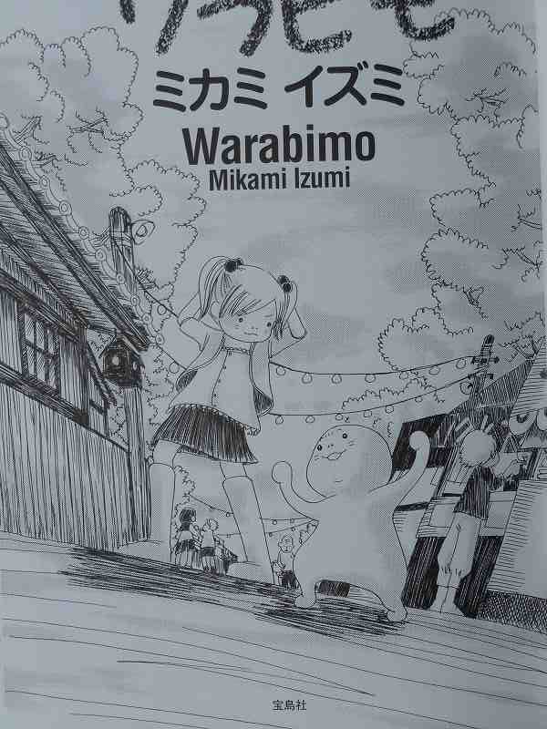
"Warabimo"- Izmon's award winning manga comic book 「ワラビモ」ー賞をもらったイズモンの漫画

Izumi Mikami or Izumon as she is called by many won a 'Zokon Award' in a new、 major manga comic book contest last year.  As a part of award, her manga comic, "Warabimo" was printed by a major publisher and is being sold in bookstores in Japan.

昨年、道都大学の卒業生で同大学で客員教師している三上いずみが第一回「このマンガすごい」大賞、編集長ゾッコン賞をとった。それにより、彼女の作品、「わらびも」が一般むけに印刷され、本屋などで販売されている。宣伝、有名人の審査員や賞金額などからみるとこの大会はメジャーな漫画コンテストのようだ。

「ワラビモ」は実際、前からいくつかのシリーズとして個人で印刷されていた。10年以上も前私は、三上さんの個展で彼女の美術作品のほか、テーブルに置いてあった、「ワラビモ」に紹介され、それ以来私はこの漫画のファンになった。


Cover of new manga print

The Japanese national comic contest in which she received a "Zokon Award" was "First Konomanga ga Sugoi ( This Comic is Great) Contest" . Judging by the size of the contest, prize money, distinguish judges, and all the hoopla surrounding it, this looks like a very ambitious, major new contest. From what I have read on article on this contest, three major awards were given, and 'Zokon prize' is the third. Overall, judges seem to praise unique originality and humor of "Warabimo".

Actually, Izumon has first written and published this manga in a series form independently more than ten years ago. I have first seen them display along with Mikami's other artworks in her one person exhibition in Sapporo, Japan shortly after she graduated from Dohto University.


title page of "Warabimo"


"Warabimo" is a story of unique relationship between young lady, Yomogi-chan, with her unusual pet, Warabimo. This manga comic is not a long continuous story, but a collection of short stories which describe various engagements of Warabimo with Yomogi-chan as well as with other secondary characters. With exception of introductory story which is about 12pages long, most of other stories are only few pages long.

What makes this comic attractive is uniqueness of main characters, Warabimo and Yomogi-chan. Warabimo is a lovable, hardworking creature that is made of gelatinous substance. He? is a 'pet' that can converse with humans and enjoy doing housework- including shopping grocery and cooking dinners. Warabimo takes care of home while his slave driving, self centered, temperamental owner, Yomogichan goes to work.

若い大人の女性、よもぎちゃんと彼女のちょっと変ったペット、ワラビモの関係がこの漫画の話だ。この漫画は長い続きの話ではなく、ワラビモとよもぎちゃんや他の仲間たちの出来事を短い話のコレクションとして本に纏めた漫画だ。一つ一つの話によりわらびやヨモギちゃんたちのキャラと世界に読者はなじみ、面白さを感じるようになると思う。

ワラビモはワラビモ科ワラビモ属ワラビモでゲル状物質でできていてそれによりゼリー寒天が好きな生物で働きものだ。ペットだけれど人間と会話でき、何故か、料理、買い物、掃除など家事が得意ようだ。わがままで、意地悪のOLの主人のよもぎちゃんが仕事で外出しているあいだ、家の手入れしている。このようなユニックで面白いキャラたちが登場するところがこの漫画の一つの面白いところだと私は思う。、


Here Warabimo is delighted that his yukata (Japanese, casual kimono) wear has same pattern as Yomogich-chan. She on the otherhand is upset and in her anger, she tears Warabimo. Later she shows the warm side enjoying firecraker with Warabimo.


The other thing that makes this comic laughable is that its story about weird S/M relationship between the two main characters. Yomogi-chan gets rid of her anger, irritation, and stress by beating up Warabimo. Her favorite pastime it seems, as shown in above comic page, is to tear off gelatinous Warabimo. At times Warabimo thinks Yomogichan is too temperamental, however it seems he likes periodically to be torn off. Warabimo becomes smaller as he gets torn apart, but he grows rapidly when he is happy. And once in a while, Yomogichan makes Warabimo happy by giving jello like delicacies for present. Although Yomogichan seems to be selfish and temperamental about 90 percent of the time, she is not an abominable character. Her disagreeable character balances too lovable Warabimo and because she does love Warabimo in her strange way.


もう一つこの漫画の面白さはワラビモとよもぎちゃんの’へんちくりん’なSM関係だ。よもぎちゃんは短期もので、ワラビモに怒りやストレスをあて自分をリラックスさせるいやな女。 かの女いじわるしたり、ぶったり、物を投げたり、ゲル状物質のワラビモをちぎったりして人生を楽しんでいる。 愛想のいいワラビモはちぎられて小さくなっても別に嫌がっていないようだ。ワラビモは嬉しいことがあればすぐ大きくなる性質をもっているようで、いじわれされ泣いたり、おこったりしてもかわいい。それによもぎちゃんいつもいじわるしても、ワラビモのことを愛しているようで、いじわるがいやになるよりへんに暖かく感じさせる不思議な魅力を持つ漫画だ。


Yomogichan also has a strange taste in man. Her hobby is collecting carve wood bear. She apparently has attraction for things big and hairy. In one episode shown above, she becomes attracted to a grizzly like, hairy new neighbor, that most normal girl would probably find very unattractive. Realizing that Yomogichan is attracted to this bear like man, Warabimo in his jealousy gets very upset. However she has upper hand as she makes Warabimo cry and delights taking photo of Warabimo's crying face.

Despite all this meanness, its hard not liking Yomogichan who has such an eccentric taste in man that it gives hope to every 'not so handsome' looking man of the world.

よもぎちゃんは普通ではない。彼女熊や熊の木彫りが大好きで、毛深い、熊ぽい男に魅力を感じる変った女性。上のイメージが近所に熊ぽい男性によもぎちゃんが引かれ、それに対し、ワラビモがジャラシを感じた時のシーンのページだ。意地悪で自己中心なよもぎちゃんだが、この男にたいしの悪趣味なところが笑え、男の私には変な魅力を感じさせる。


First private edition


As I have said earlier, "Warabimo" was published earlier in small, private editions. Several issues were printed. These are cover illustrations of some of them:

前に述べたように「ワラビモ」は前にも個人で印刷されたことがある。上と下のイメージがそれらのカバーのイラストだ。


There are some slight differences between the original and mass published "Warabimo". For one thing, the mass one is in a printed letter while the original is hand written. Also some background treatment is different. Notice the differences in pages below where the same scene is depicted.

オリジナル版と今回のとはいくつか違うところがある。オリジナルは文字が手書きで最近のはプリントだ。それと少し、せりふやバックの塗りがところどころちがう。オリジナルの漫画をもっている人たちにとってはこの違いを見つけるのも面白い。


Anyway, I recommend "Warabimo" highly to anyone who likes a bit of unusual comic or just plain odd story. Izumon is very original artist, and in her art, lots of warabimo like colorful characters roam so if you have chance to see her art exhibitions, I would encourage for you to go see them for you will be guarantee to have a fun time.

とりあえず、ちょっと変った漫画が好きな方、「ワラビモ」進める。三上はワラビモ」のほか色んな美術分野で活躍している。三上は大変オリジナルなアーチストで彼女の世界、ワラビモのような変ったキャラーがいっぱい登場するから、彼女の作品展見るチャンスがあったら楽しいからぜひ見るように進めるよ。


Photo from Izumon's exhibition from two years ago
二年ほど前の三上いずみの個展の写真

Friday, April 15, 2011

Work in Progress: Tree of Energy, Tree of Life 作品制作中[生命の木はエネルギーの木]

"Tree of Life, Tree of Energy#6" branch part near completion
「生命の木はエネルギーの木#6」製作中ー枝の部分完成近く

One of the series I am currently working on is " Tree of Energy, Tree of Life".  With this group of work, I am planning to express the idea that the whole universe including our souls are form of energy; that is, life itself is energy and its 'eternal' and it metamorphose.

最近はいくつかの種類の作品を同時に造っている。その作品シリーズの一つは「生命の木はエネルギーの木」というシリーズである。これらの作品で我々の魂も含めて、宇宙生命の正体はエネルギーで’いつも形を変えながら’永遠’に続いているのではという考えを述べたい。


"Tree of Life, Tree of Energy#5" branch part near completion
「生命の木はエネルギーの木#5」製作中ー枝の部分完成近く


To achieve this, I am planning to make several tree shape sculpture pieces that are constructed from assembling several pieces of branches.  After completing them, like Christmas Tree I am hoping to 'decorate' them with colorful shapes that imply energy forms.

I have cut small branches off several species of shrubs and trees around my yard. Each
different species gave different shapes of branches that make each Tree of Energy unique and interesting. After taking the bark off freshly cut branches, these are then assembled together with mostly cotton cord and wood glue. In a larger piece of branch, wires are used to connect together,but this process was rarely used in this group of work.

これを成し遂げるだめに今年の春早く、いくつか種類の木から細く、短い枝を切った。そして少し乾いたあと、木肌をとり、それらを細い縄とボンドで木の形に組み立てた。作品によって違うがだいたいやく、70センチから一メートルぐらいの大きさの作品が一番このシリーズの作品にふさわしいようだ。裸の木の形ができる段階まで今きているが、それからエネルギを表す、飾り物を造る予定でいる。ちょっとかわったクリスマスツーリか七夕の飾りのようなものとしてしあがると思う。


photo of completed skeletal form of Tree of Energy, Tree of Life #3
完成された「生命の木はエネルギーの木#3の骨組み


Completed skeletal form of "Tree of Energy, Tree of Life" #1 on the table, and #4 in progress on the floor to the right。
テーブルの上の作品は生命の木はエネルギの木#1で下に置いてある作品は#4である。骨組みの部部んがやや完成されている。


Below three photos shows thin branches of Gynko wood being assembled together with wood and cotton cords for Tree of Energy, Tree of Life #6 piece 下の三枚の写真では細い、イチョウの木の枝を綿の糸とボンドで木のの形を組み立てて「生命の木はエネルギーの木#6」の形を作っているところ。


Tree of Energy, Tree of Life #6 in progress
「生命の木はエネルギーの木#6」制作中

After this stage, I will further strengthen by pasting a thin cotton cloth over the area tightened with cord. Further as shown in pieces #1 and #3, they will be covered with wool cords. この段階が終わると、枝を糸でつないだところをボンドで木綿をはる。そしてその上にウールの太い糸で上の作品#1や#3のようにかぶし、裸の木が完成。


Sunday, December 12, 2010

"Twinkle, twinkle, zig zag- Mario's exhuberant paintings" 「キラキラ、ジグザグーマリオ氏の輝く絵画」

View of Mario Caoile's Exhibition from gallery entrance


My artist friend from olden days, Mario Caoile shared December exhibition space of Blackfish Gallery with me. Mario showed mostly paintings, but there were three painted sculptures that were also exhibited. These were mostly abstract paintings though one can see a shade of dog or figure like forms here and there.


Here, Mario's adjusting microphone for video shooting. Displaying from left are paintings"Terra Illumina"and"Next Step" ビデオ撮影の途中マイクをチェックしているマリオ氏。


今回友人のマリオ氏と一緒にブラックフィシュで展示した。昔ながらの芸術仲間で一時よく彼と彼の奥さんのヘレンと魚つりにいったが私たちずいぶん年をたった。だだ私は三流物まねの品の無いバージョンの 毛沢東氏にだんだんと似てきたような気がするが、マリオは高貴な姿のガンジーに似てきたようだ。

マリオは主に絵画を展示したが、そのほか彫刻も三点展示した。主に抽象画だが、良く見ると所々、犬や人体のような形も含まれている。彼はブッラクフィシュ画廊・ギャラリーではコンピュータ関係の仕事やビデオなどをとる役をし、もっとも忙しく、貴重な存在だ。私のビデオも彼がとり、dmカードや写真なども彼が手伝ってくれている。


"Terra Illumina" 「テーラーイルミナー」(輝地球)


I have heard people comment Mario's works with words like energetic, musical, illuminating, playful, spontaneous and labyrinth like when describing Mario's recent works, and these I think are appropriate. Title of works like "Detour","Zig Zag" Twinkle", "Terra Illumina", "Doggone it", "Yes Kangaroo" shows his awareness of effects of his works and also the playfulness . With this group of Mario's works, rather than think over deeply about what he tries to express, I enjoy most just absorbing the spirit Mario's paintings emit.

人々はエネルギシュ、音楽的、光輝いている、あぞび心,迷路、などの言葉でよく彼の作品を表している。私もそう思う。「ジッグザッグ」、「キラキラ」「,ハイ カンガルー」などの作品題彼自身も同じく思っているようだ。難しく、考えて作品を描くというより、感、その時の気持ちなどで描いているよう。それでマリオ氏が何を表現しようと考えるよりも作品から受ける気持ちを感じたほうが彼の作品を楽しめると私は思う。


"East& Wes&" 「東と西と」


Detail of "East&West&"「東と西と」

This "East&West&"piece is probably my favorite painting in this exhibition show though I like "Next Step" and couple others nearly as well. It has for me a powerful presence which appeals to me greatly, but is hard to describe.

この上の作品「東と西と」は今回展示されたマリオの作品の中では私がもっとも気にいっている作品だ。何故か私には強い存在感をこの作品に感じる。


Another thing I sense from this exhibition is that though each painting in the show is piece by itself, I sense all of the piece as one piece as though its one whole installation work. The colors and forms in all the work is similar and provides unity and small pieces near the floor of the gallery ties individual works together. But for me the main reason is the feeling I get that all the work- reflect lights, music, and thunderous energy towards the center of gallery.


今回のマリオの展覧会でもう一つ感じるのは一つ、一つの作品を別々にとるほか、全体が一つのインストレションのサック品に感じることだ。同じのような色がほとんどの絵に使われていることや、小さい作品が床近く置いてあり全体のショーをつないでいるところもそのような気持ちにさせる。だが、絵全体がまるでギャラリーの中心に向けて、音や光などエネルギーをだしているように感させるのがじる一番の理由かな。


"Sculpture Take Up Your Bed"[彫刻が貴方のベッドを取っている」

In the past, Mario use to weld scraps like bed springs together to form a metal sculpture. Lately, I see him revive these works by repainting them. I think these metal sculptures are appealing just with forms by themselves. But painting over gave additional interest. In fact Mario's painted sculptures are among my favorite of all Mario's repertoire. I really like them a lot!

マリオは昔良くベッドスプリングなど鉄くずを溶接でつないで彫刻作品を制作していた。最近これらにペンキなどを塗って再生している。塗る前形だけでも魅力があったが、色を塗ったらもっと面白みがでていると思う。彼の全体の作品の中でもこれら塗った作品は私のお気にいりだ。

"Zero Gravity" 「ゼロ引力」

Monday, December 6, 2010

"Face Fruits and Leaves and Branches of the Tree of Life Exhibition" 「フエースフルッツと生命の木の葉っぱと枝」展

a panorama photo of opening night at Blackfish ( all photos by M. Caoile)
アメリカの学生ら若い客たちに説明している私。オプニングの時のパノラマ写真
 (すべての写真ーマリオ氏)


Together with my artist and fishing friend from olden days, Mario Caoile, I am exhibiting artworks at Blackfish Gallery in Portland, Oregon. My part of exhibition is titled " Face Fruits and Leaves and Branches of the Tree of Life" and is a further development of this theme that I have been working on for years. Face Fruits are the product of my version of the Tree of Life, and it represent you and me and everyone else who have lived, are living and will be living in days to come. With my Tree of Life works, I wish to express uniqueness of each living things and at the same time, unity of the whole universe. Another word, each of you are unique, important part of the universe, and at the same time are all a part of Creation, therefore are all equal. Since the Tree is both the Creator and Creation, being parent to all of us, the Tree is neither for or against anyone, but loves you all.

I have been making Face Fruits for about ten years now. In Japan, I have made them from non-firing clay for modeling, but here I have used a material that is a mixture of fiber and glue. Consequently, these Face Fruits are not as detailed as clay. They also seem fibrous and a bit plump than those of clay. In these recent pieces, I have attached wooden branch. I believe this made these Face Fruits more like fruits than before.


Along with Face Fruits on the wall I have also exhibited an installation piece that represents a harvest time of the Tree of Life. Because various events are scheduled to be held on this gallery space during our exhibition, I have decided to exhibit the ground installation towards back corner of the gallery space. Later after these events are over, I am planning to extend the installation closer to the middle area of the gallery- in the process altering the form and make a different version. I already have altered once so altogether I will probably have three different version of this installation piece.


Above photos, various view of the installation piece, " Face Fruits and Leaves and Branches of the Tree of Life"
 (上)様々な角度から撮った「インストレション作品、「フエースフルーツと生命の木の枝と葉っぱ」


今、ポートランド市のブラックフィシュ画廊・ギャラリーで私と昔からの魚釣り・芸術仲間のマリオ・カオリ氏と二人展を開いている。友人のマリオ氏は絵画と昔の溶接を新しく塗りなおした彫刻作品三点を展示している。私は日本でも制作していたフェースフルーツの作品とインストレション作品一点を展示している。

アメリカでの展示はやく一ヶ月が通常であるから、11月の30日から、大晦日の12月31日まで展示することになっている。今度の展覧会はアメリカへ帰国してから二回目でいずれも今年に開いている。今回展示した作品も前回と同じくすべて全部始めて展示したものばかり。

テーマは「フェースフルーツと生命の木の枝と葉っぱ」でこれは私の作品のメインテーマと同時、宇宙のつなぎと一つ、一つの生命のユニークな存在について語っている。得意ではない日本語で説明しづらいが、上の英語の文章をだいたい訳した。「我々はそれぞれ宇宙の一部であり、みんなつながっている。その大宇宙を私はシンボル的に生命の木として描いている。それにみんなつながっているが、それぞれ違う、別々な存在であり、他、二つもない基調な存在でもある。私の制作の中では生命の木は天地創造であり、また創造者でもある。したがって、すべての存在は生命の木の子である。生命の木は親としてすべての存在大事であり、それぞれ同じく愛するものである。

今、世界は毎日ごとに狭くなってきている時代。今では色んな面で世界はつないでいる。そして色んな人々がそのつなぎを感じている時代、それぞれ、みんなが仲良く、お互いを尊敬しながら、生きていくことを私は望む。欠点だらけの私だが、リラックスし、前むきな時このようなことを願う気持ちが生まれ、「生命の木の」作品を制作するように進めた。

View of my side of exhibition from the gallery entrance. 入り口から撮った写真。


今回のフェースフルッツは日本のころに造っていたものとは少し違っている。まず粘土の代わりに、ファブリックとボンドで混ざった材料をつかった。これにより、顔などがはっきりとはしないが、ふあふあとしたファブリックの暖かく、やわらかい特徴がでている。又、色のステインなど塗らなく、材料の色を生かしている。この材料は私が勝手に作りあげたものでみんなが不思議がっている。ビーズワックスとよく間違われる。軽く、アクリルのつや消しニースをぬるから頑丈で必用としたらふける。これで造ったフエースはまだ物足りなく感じたが枝をつけばけっこう良く見えた。もともと、次の段階でフエースに枝をつける予定でいたので、ちょうどよかった。私はインストレションのほうに忙しいのでブラックフィシュのメンバーケンツリとクリスたちにフエースフルーツを展示してくれと頼んだ。好きなように展示してと言ったら、このように展示した。


Up above- Various Face Fruits
(上) 様々な陳列されたフエースフルーツの作品

Asha, Jamaican Dancing Girl
ジャマイカーのダンサーアーシーャー

Captain van Doogen of Dutch Militia
オランダのヴォン・ドーゲン隊長